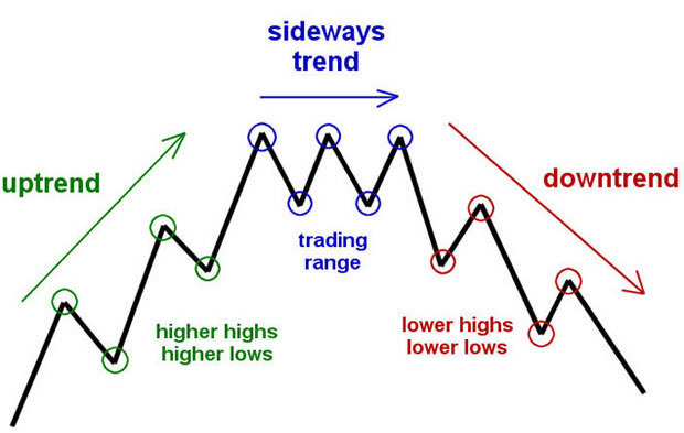
The ETFs market is a huge reflection of crowd psychology playing over two basic human emotions; greed and fear. Professional ETF traders understand this, and rather than relying on greed and fear, they keenly follow the mood of the market as informed by technical analysis and/or candlestick patterns.
Technical analysis of any price action is done through indicators which derive their strength from past price actions. Indicators are powerful tools for predicting market trend, market momentum, volatility, stop-loss targets, and more. Technical indicators are valid for all tradable instrument including individual stocks, indexes and ETFs.
In theory, following any one indicator can be lucrative but it’s coupled with an equally high risk of loss. As such, in real life situations, it’s best to make trades based on holistic analysis using multiple indicators. You should look at points “where all the stars are aligned” and where every, or at least most of the indicators, predict the same outcome. For example, look at the RSI, Bollinger Bands, Keltner Channel, different moving averages, Stochastics, and several other indicators before making a trade.
In this chapter, we are going to look at the best performing indicators for ETFs; indicators that give the highest success ratio.
You can use any type of candlestick to go with the following indicators, but we recommend using Heikin-Ashi Candlesticks, as the charts are smoother and less noisy compared with normal candlesticks. Even better, almost all modern trading platforms have the option of Heikin-Ashi Candlesticks.
1. Moving Average- The Market is a Dance of Moving Averages
One of the most important concepts in the Dow’s Theory is moving averages which depict the entire history of an ETF. Moving Average is a good compass for market trends and a good basis of establishing support/resistance levels. There are two types of Moving Averages; Simple and Exponential moving averages.
Traders who prefer longer period trades should go for simple moving average and high-frequency scalpers and quick traders should use the exponential moving average.
The success ratio of moving average as a sole indicator is over 60%, and when combined with other indicators, it becomes one of the most powerful and core indicators of any trading strategy, yielding up to 90% success rate. Most trading platforms offer Simple Moving Average (SMA) and Exponential Moving Average (EMA) for different time periods like 5m, 15m, 30m, 1 hr., 1 day, 1 week, 1 month, etc.
Depending on your trade’s time frame, you should choose three different moving averages. Moving averages of different time frames tend to converge and diverge according to the market trends. The point where two moving averages meet is the point where you should execute your trades.
Typically, go long once you see a MA of lower time frame “crossing over” a MA of higher time frame. It means that the stock/index/fund is in a positive momentum or is simply bullish. Take a short position if the reverse happens. Moving Averages, if used with right combinations, can predict the broad market trend accurately.
Let’s take a closer look at a simple example of how moving average can predict a price action.
Illustration 1:
The chart below shows a classic example of a profitable trade, using the concept of moving average. The ETF we chose was SPDR S&P 500 ETF Trust (NYSEARCA: SPY), over a weekly period. The red line represents the 20-day Simple Moving Average (20 SMA) and the green line represents the 50-day Simple Moving Average (50 SMA).
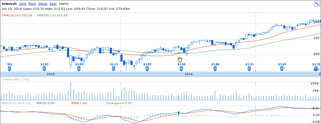
We see an extended period of consolidation from the mid-2015 to the beginning of 2016, where the 50 SMA was above the 20 SMA. However, there is a strong 20 SMA crossover at 210 level. Since this is a weekly chart, the indication is a strong one, and this is evinced by the subsequent price rise towards 240 levels, with a final high of 245 giving a neat and clean 14% return.
If you are a skeptical trader and want to be sure before executing the trade, look at the MACD, which is making higher highs and a positive divergence after the SMA crossover. That is a high probability uptrend that you can bet on.
Here is a similar example, but for a downtrend, where you can earn money by going short. The red line is 20 SMA, which is crossed over by the bigger 50 SMA. Notice that the crossover takes place at 140 level and during a negative divergence (-0.84) between the MACD and EMA. This signals that the bears are in control, and it’s a powerful sell sign.
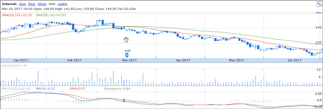
Moving Averages can also be used as reliable resistance and support levels. Resistance levels are points which act as a strong bearish wall, while support is the line which provides good “bouncing” points for the a given price. For example, in the above chart, the 20 SMA (the red line) acts as a strong resistance for the downtrend. Notice that, whenever the price touches or tries to pierce the 20 SMA, it intensifies the downtrend. This can be used by short time traders to place profitable shorts. Other than the 20-50 Moving Average combination, you can also use the 50-200 SMA to get a broader perspective into the ETF.
2. RSI – Locating the Greed and Fear.
The two most fundamental forces that control the market is greed and fear. It is a well-known saying that “bulls make money, bears make money, pigs get slaughtered”, personifying pigs with greed. The best way to quantify fear and greed is to use oscillators indicators, like the RSI (Relative Strength Index). Note that Relative Strength Index is one of the most important and handy indicators, especially for swing traders. It is a momentum oscillator and is used to verify the momentum of a trend.
The concept of RSI is simple to understand and easy to apply. RSI, like most oscillator indicators, is a band which indicates overbought and oversold conditions in a price movement.
The RSI indicator moves like a pendulum, swinging between the two extremes of overbought and oversold conditions. The actual level is determined by the technical set-up, but usually, if RSI crosses over 80, it creates an overbought situation while any level lower than 20 becomes an oversold situation. The more it deviates from these extremes, the greater is the tendency to revert to the mean position. In any trade, the RSI value can’t move lower than 0 or higher than 100.
The logical course of action is to sell when RSI value increases beyond 80 (overbought), and buy when RSI falls below 20 (oversold). Now there is no compulsion for the RSI to go beyond 20/80 to be justified as oversold or overbought. It has to be combined with a trend indicator and candlestick patterns.
Let’s look at an example.
For simplicity, we will not complicate the chart with other indicators, but it’s advisable to take multiple indicators into account before making a trade.
Below is an iShares MSCI Emerging Markets ETF chart, with a 14-day RSI indicator, which is the last column. Notice that the given setup has a RSI band between 88.43-15.79, i.e. the extremes which indicate it’s specific oversold and overbought conditions.
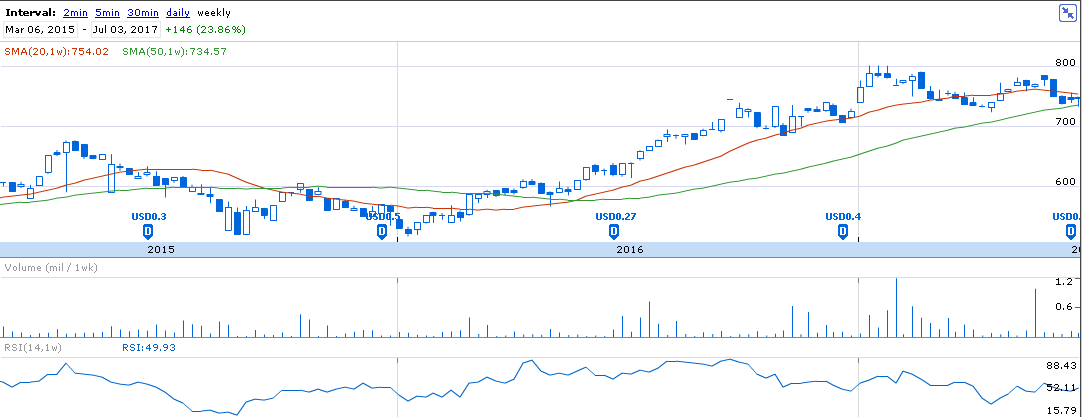
Notice the first dip in RSI happens somewhere around September 2015, when the price was $550 and RSI was 15.79. This indicates a strong oversold condition and professional traders would take a long position at this level.
The price goes to $600 a share and then moves back to $550, but the RSI value is locked at 33. This means that there is a potential uptrend and the stock still has an inner momentum. The momentum is finally confirmed with the SMA crossover in mid-2016 after which the price of the ETF goes off to $800, which is a comfortable 30% return.
Now, notice that once the trend is confirmed by the SMA crossover, the RSI never went beyond 50 in the year 2016. This indicates the presence of a strong bullish momentum and you can look to buy into the dips. Again, you can safely use the 20 SMA (the red line) as a strong resistance for buying into the momentum.
Here is another example of RSI, where it locates an overbought condition in the daily chart of iShares MSCI Germany ETF. The 14-day period RSI is used.
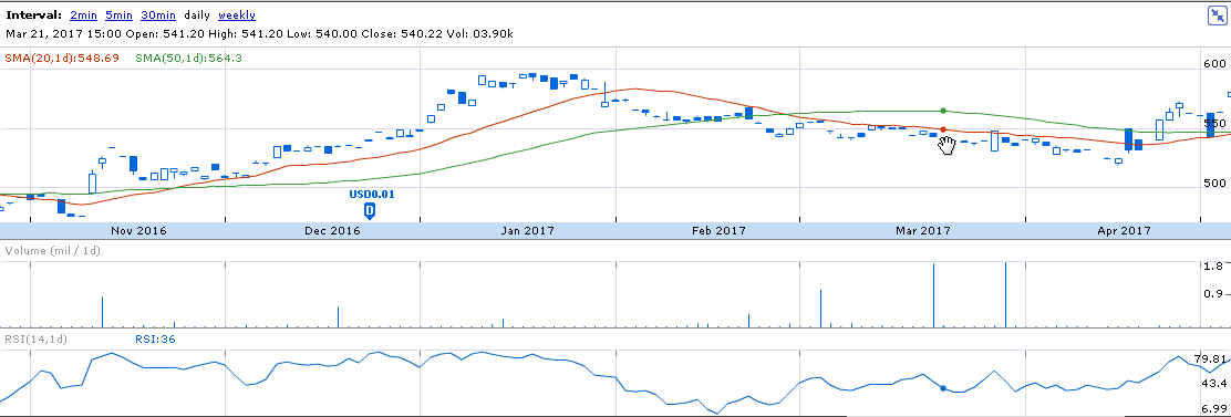
Notice that the RSI has peaked itself in January 2017, and is somewhat consolidating at the $580-$570 levels. With a number of Doji candlestick patterns appearing in the consolidation phase, after an uptrend, it clearly indicates a period of indecisiveness in an overbought area. This is where a smart trader would take a short position. The price eventually reaches 520 within 2 months, giving off a 12% profit over a short period of time.
RSI can be used for a smaller time frame, even for hourly traders. However, it is wise to check on the general RSI value before trading within specific time frames. For example, if you want to trade within the hourly chart, you should be aware of the RSI value on the daily chart. The RSI indicator for smaller time frames (like 1m, 3m, 5m) can be fickle and sometimes oscillate too sharply. You can then use a 21 or higher period RSI to smoothen the oscillation frequency.
3. Fibonacci Retracement- What Goes Up, Must Come Down.
One of the fundamental characteristics of any ETF/index/stock is the bearish and bullish forces, which create a zig zag pattern in the charts. No stock price ever goes on increasing and no stock price can always remain in a downtrend. Many swing traders take advantage of this to execute quick trades, with well-defined stop-losses.
In any trend, the momentum first increases and reaches a peak from where it collapses, taking the price of an ETF down to a certain level, before reverting to its original trend. Hence, this requires a specific stop loss, which is provided by the Fibonacci Retracement indicator. These pullbacks, which are known as retracements, are temporary and provide nice opportunities for quick traders to make profits in overbought/oversold conditions, and a chance for momentum traders to exploit the general trend.
According to the Fibonacci Retracement theory, any trend will have strong resistance/support at 23.6%, 38.2%, 50%, 61.8% and 100% of a fully established trend. The overall trading strategy is formed by looking at these consecutive support/resistance levels. For example, if an ETF is making higher highs and higher lows, then it is in an uptrend, and generally, the resistances become the new support bases.
Below is a pictorial representation of this type of movement. The first movement marked in green is a clear bull run, the blue part is a consolidation phase, and the red part depicts a typical bearish grip.
This movement is quantified by the Fibonacci Retracement in strong trends, which predicts strong reversal tendencies at the 5 fundamental levels/ratios; 23.6%, 38.2%, 50%, 61.8% and 100% of a price movement.
Here is an example of Fibonacci Retracement (FR), appearing on a daily chart of FXG, a consumer staples ETF.
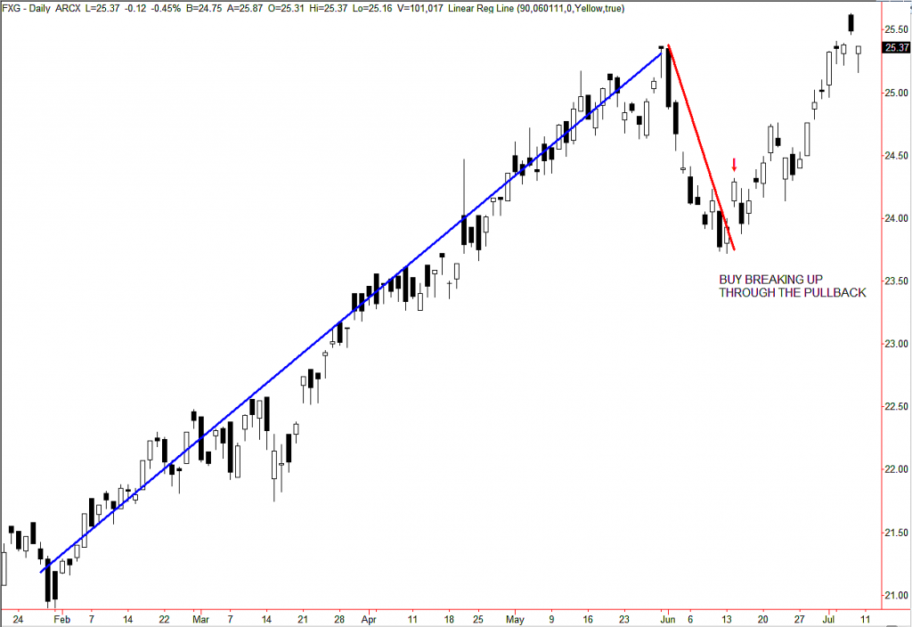
The Fibonacci Retracement is constructed using two extreme points, one is the starting point of a trend and the other is the peak of a trend. Both points are further verified by candlestick patterns and other technical indicators. In the following example, we take the $21 as the lower level of the Fibonacci Retracement and $25 as the upper.
After achieving a $4 rise, over a $20 base price (20% increase), from February to June, we see the appearance of an Evening Star Doji on June 1. This indicates a clear loss of momentum and a signal that the bears have taken over the market. The price falls off through $1, which is a 1/4th increase. This corresponds to an approx 23.6% fall from the first phase of the trend. Once you see this fall, you know that this level becomes the new resistance and price will be forced to bounce off this level.
Professional traders will use this dip to go long again at $23.65 and experience the next leg of the bull run. This will actually continue off till the next Fibonacci level of 38.2%, which will become a temporary resistance and then change into a support, with further uptrend.
This is similarly true for a downtrend, when the price springs up temporarily before continuing the bearish run.
Almost all trading platforms have the Fibonacci Retracement and it can be used by professional players for scalping a trend for quick profits or entering a fresh position at such temporary retracements. This is also a good indicator to analyze the shifting resistance and support bands, which can help us determine our target and stop loss.
4. Bollinger Bands: The Mean and the two Deviations.
Bollinger Bands is a classic indicator, developed by an astute trader, John Bollinger. He devised a simple way of tracking the deviations from a particular moving average, usually a simple moving average, by creating a parallel running bandwidth. The bandwidth encompasses the “highness” and “lowness” of a price action and is a good measure of volatility.
Bollinger Bands consists of a main N-period Moving Average, which is the middle line and two standard deviations, forming the upper and lower limits of the bandwidth. The way these bands are pierced can tell a lot about the underlying forces.
Let’s take a look at a natural piercing of the 10-day Bollinger Bands, through a daily chart. In the given figure, the middle blue line is actually the 10-day SMA, the green line represents the upper deviation (Upper Band) and the red line represents the lower deviation (Lower Band).
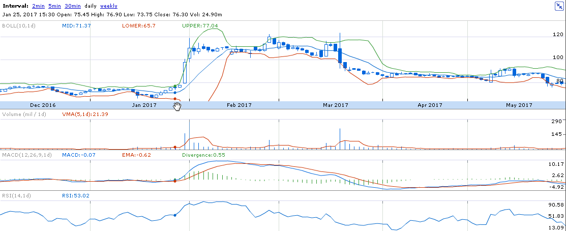
Notice that, at the end of January 2017, there is an unusual expansion of the Bollinger bands. The candlestick pieces into the upper band with a strong but gradual uptrend, taking the price from $80 to $120. The stronger the piercing, the stronger is the inner momentum and volatility in the ETF. Once the price consolidates to a new level, the Bollinger bands constrict itself to the mean position.
Bollinger bands are also used by swing traders to take advantage of sudden price movements. Since the price always tends to revert to the mean position after a sudden deviation, some traders immediately revert the Bollinger trend to make quick scalping trades.
In the above diagram, when the price starts to drop during February and March, the Bollinger bands again expand and the candlesticks touch the Lower deviation band (red line). We can also see a strong MACD crossover at the end of February, signaling a losing momentum.
There is an unexceptional spike in the Average Volume indicator, signaling a strong bear run, which eventually brings the price down to $80.
As a golden rule while following Bollinger Bands, always buy if there is a gradual expansion towards the upper band and sell once there is a strong deviation from the mean band towards the lower band.
5. VIX Index- Only Thing We Have to Fear Is Fear Itself.
VIX is a 30-day volatility index, which is also known as the Fear Index. It is not available for individual stocks but assumes prime importance in the technical analysis of ETFs, currencies, options, and other indexes. VIX is basically the volatility index of Chicago Board Options Exchange (CBOE), the world’s largest exchange. It measures the probabilistic volatility of the S&P 500 Index options and is one of the best ways to get an idea of the general market direction. VIX is usually inversely proportional to the S&P 500 index and consequently all the linked ETFs.
Below is a VIX vs. S&P 500 chart, where you can see the inverse correlation between the two.
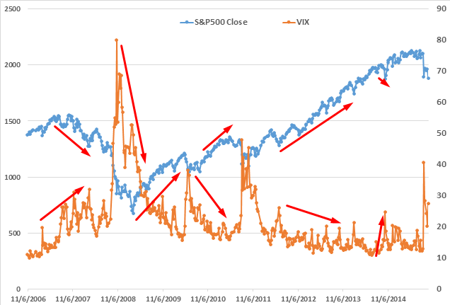
The VIX indicator is measured as a percentage, which predicts how the market will go based on its current activity. Rapid changes in the market forces will trigger a rise in the VIX indicator, which can signal zones of danger to avoid. The VIX indicator particularly becomes very active, achieving 70-80%, before and during a period of burst and reverts towards 10-20% during periods of boom.
Most of the time, the VIX indicator tends to stay below the threshold value of 20%, which indicates normal market activity. Any sharp spike in activity/volatility is reflected by an increased VIX, which sharply reverts back to the original. This phenomenon can be seen in the above graph, which shows a sudden spike just before the 2008 financial meltdown when the VIX touched a record 82%. Since then, the VIX experienced momentary bursts, notably during a 10% movement in the S&P 500 index (2010-2011).
A decreasing VIX, however, indicates a rising market for S&P 500 ETFs. The market is on the rise since 2009, during which the VIX reverted back to 20-10 % levels. You should keep an eye on the VIX indicator if you are holding any long-term positions and want to limit losses during unforeseeable events.
How to Use the Indications in Unison.
Indicators are like sticks, which can break if it stands alone but becomes powerful when many are bundled and used in unison. The key to successful trading, therefore, boils down to harmonizing the various signals from different indicators into a comprehensive picture. This does require some experience to actualize during live trading sessions, but finding common ground between various indicators is the bedrock of successful trading.
The chart we will be using is a recent 30-mins chart for Power Shares QQQ Trust, Series 1 (ETF), and we are going to follow the ETF for a week and look at points where we can enter profitable trades based on the indicators mentioned above. The details of the indicators used in this trade are.
- Simple Moving Average- 20 days (red line), 50 days (green line) and 200 days (pink line).
- Bollinger Bands- 10 period.
- MACD- Short Period: 12, Long Period: 26 and EMA period: 9.
- RSI- 14 Period.
- Volume Moving Average- 5 Period.
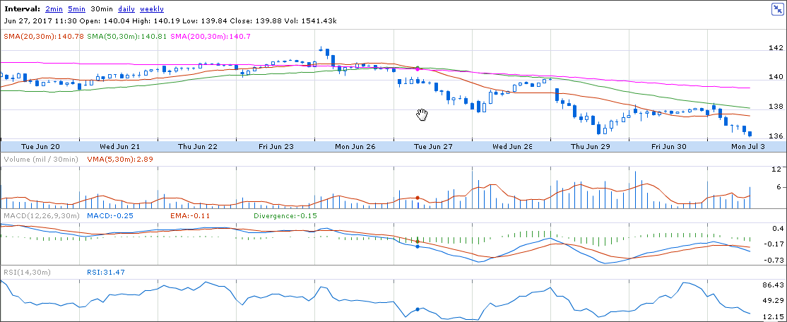
This is the first chart, where we confirm the formation of a trend through the 20 days (red line), 50 days (green line) and 200 days (pink line). The 200 day SMA overtook the 50 day SMA, which signals a potential bear grip in the medium term. The 50 day SMA also closed above the 20 day SMA, which confirms a clear downtrend in the short term. We can also see that the ETF is using the 50 day SMA as a resistance to this downtrend. As this is a strong resistance, we can sell whenever we see the stock price hits the 50 SMA (Wednesday, 28 June ending, Monday July 3 beginning), once the downtrend is established.
At this point, we remove the SMAs from our chart and introduce the 10 period Bollinger band into the chart, which now looks like this.
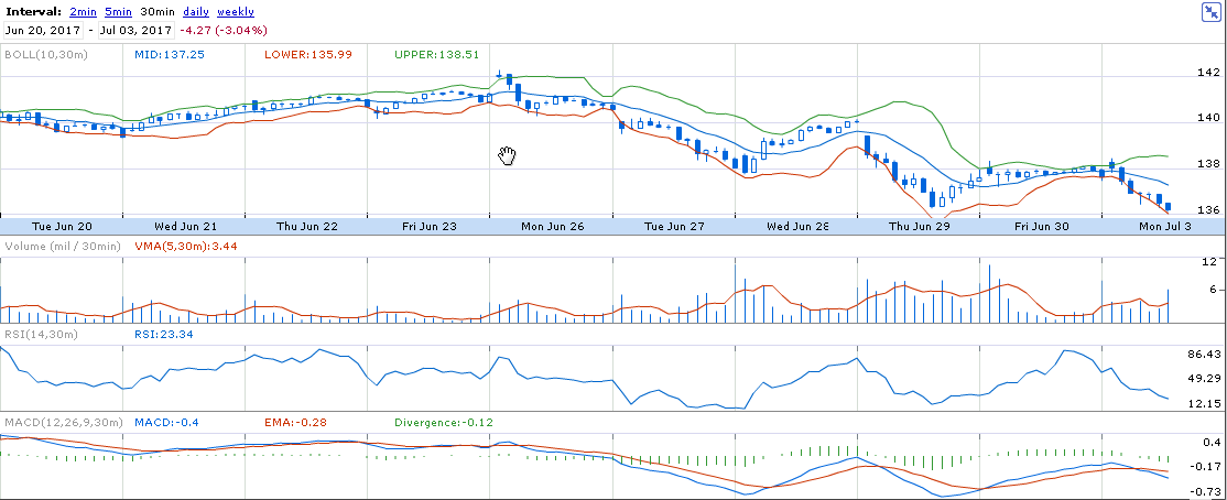
Notice that the Bollinger band was tight and compressed from June 20 to June 23, which signals a period of low volatility and overall consolidation. Once the market opened on June 26th, you can see a spinning top Doji formation at a 30 mins level. The Bollinger Bands are starting to open up, with the candlesticks piercing the lower band. At the same time, you can see the RSI value peaking at 80 levels and MACD showing a negative divergence of -0.12, signaling a new bearish trend. This is a point where three powerful indicators point to a single thing and it can be a strong signal to sell at this point. We can take a short position here and draw a Fibonacci retracement, which would naturally layout 140, 138, 136, 134 (rounded off) as the support and resistances for the downtrend. This is exactly what the price action does, as it reverts off to 138 on Tuesday June 27. On Wednesday June 28, the price of the ETF starts off at 138, which is a temporary support. It rises but could not breach its earlier resistance of 140, which has now also become the 50 SMA-downtrend-resistance. This signals an immediate selloff in the ETF.
On Thursday June 29, many interesting things happen, which require a detailed look.
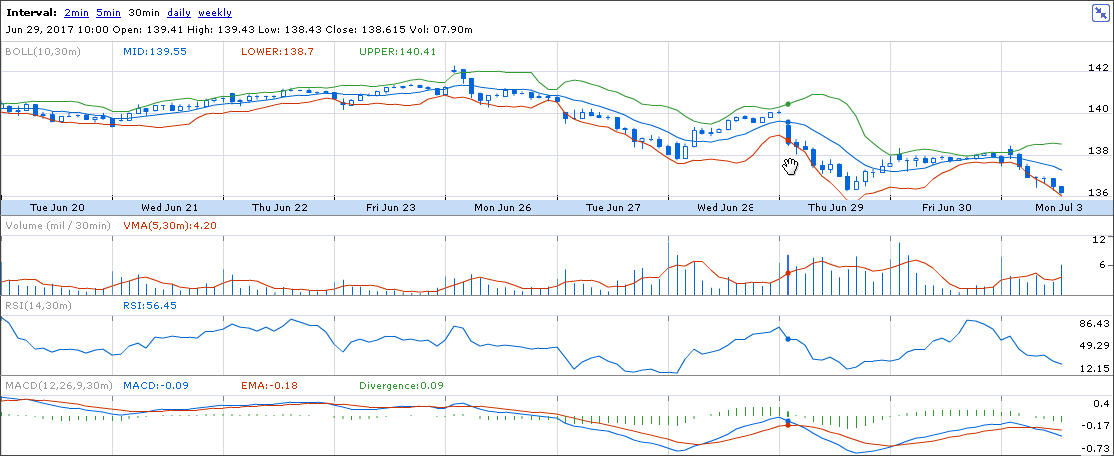
Notice, there is a strong volume growth in the opening hours on Thursday June 29th. This represent a bearish volatility, as the RSI value at 82 is suggesting an overbought condition. This is another lucrative point to sell the ETF as “all the stars are harmoniously aligned”, and we can expect the price to move down towards 36 and then towards 34. Moreover, there is a MACD divergence happening on Monday July 3, which again confirms a downtrend.