How does a trader get a quick pulse of the market? There are indices and sectors galore along with way too much information. This adds up to information overload and not enough time to intelligently decipher the information into a meaningful trading strategy.
After years of studying the markets and just plain experience in the business world, I started to focus on 5 stocks. These 5 stocks give me a quick picture of the overall attitude of the market and give me a heads up to trend changes in the market. Think of it this way. The foundation of a house cracks and crumbles before the house falls. Looking at components of the market gives a good indication as to the condition of the market’s foundation. Consequently, I look at these 5 stocks first every evening and then proceed to look for trading opportunities.
The five stocks are:
- COPX (Global X Copper Miners)
- FDX (FedEx Corp)
- URI (United Rentals, Inc)
- XLF (Financial Sector ETF)
- SPY/IWM (SP-500 ETF and Russell 2000 iShares ETF)
COPX (Global X Copper Miners)
COPX is the copper miners ETF. The top three holdings are Southern Copper (SCCO), Oz Mineral LTD (OZMLF) and CST Mining Group LTD (Listed on the Hong Kong Stock Exchange under stock code 985). The most familiar company in this group is Southern Copper.
Why look at copper? To answer this question let’s look at how it is used. Copper is lightweight, durable and heavily used in the construction industry. It is the third most widely used metal for industrial applications next to aluminum and iron. More than half of the copper produced is used in electrical applications such as power generation, televisions, computers, mobile phones, electric circuitry and microprocessors. Copper is also used in the transportation industry for the construction of trains and cars. It is used in the production of household items such as fixtures, doorknobs, sinks, bathtubs, counters, and heating cylinders. Because copper is so versatile and used in many industries, a rising copper market often means its associated industries are also rising along with the overall stock market.
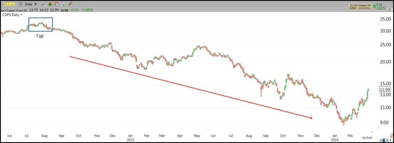
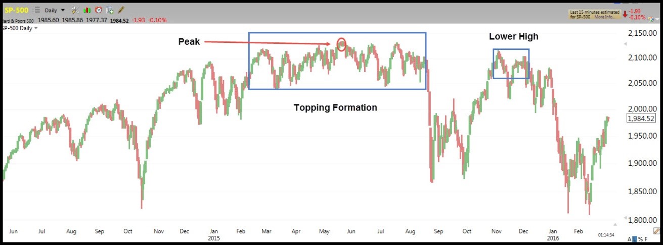
Due to the widespread uses of copper, many feel that it can be a leading indicator for the health of the economy. The chart below shows how COPX topped out in July/August of 2014. It has been in a downtrend since then. Was this a warning of a weakening economy and potentially a precursor to a topping in the stock market? It sure looks like it.
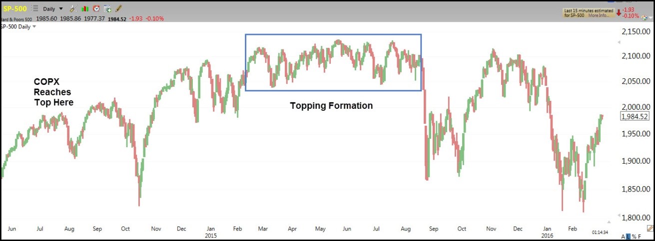
Notice in the chart below how COPX reached a top six months before SP-500 started forming its topping formation.
SP-500
FDX (FedEx Corp)
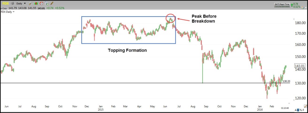
FedEx is the top holding in the IYT Transportation ETF. More importantly, an increase in shipments demonstrate the strength of business sales which leads to revenue growth and a rising stock market. Of course, a decline in shipments relates to weakening business sales, declining revenue growth and a declining stock market. The strength of FedEx stock is reflected in the stock’s price.
One sector that correlates well to FedEx is retail. When consumers are spending, retail stocks rise and so does FedEx. Looking at the direction of price in FDX can tell you the potential direction of retail. They are highly correlated and often FDX leads the direction of retail. A good way to look at retail is by looking at the retail ETF RTH. The charts below show this correlation.
FDX
RTH
Notice how FDX reached a peak in June 2015 and started forming a top in November/December 2014. About four months later RTH started its topping formation and put in a peak in December 2015 before its breakdown. As of March 4, 2016, will the downtrend continue in RTH? Time will tell. However, you can see how FDX can be used as a leading indicator for retail stocks and possibly the stock market in general.
URI -United Rentals, Inc.
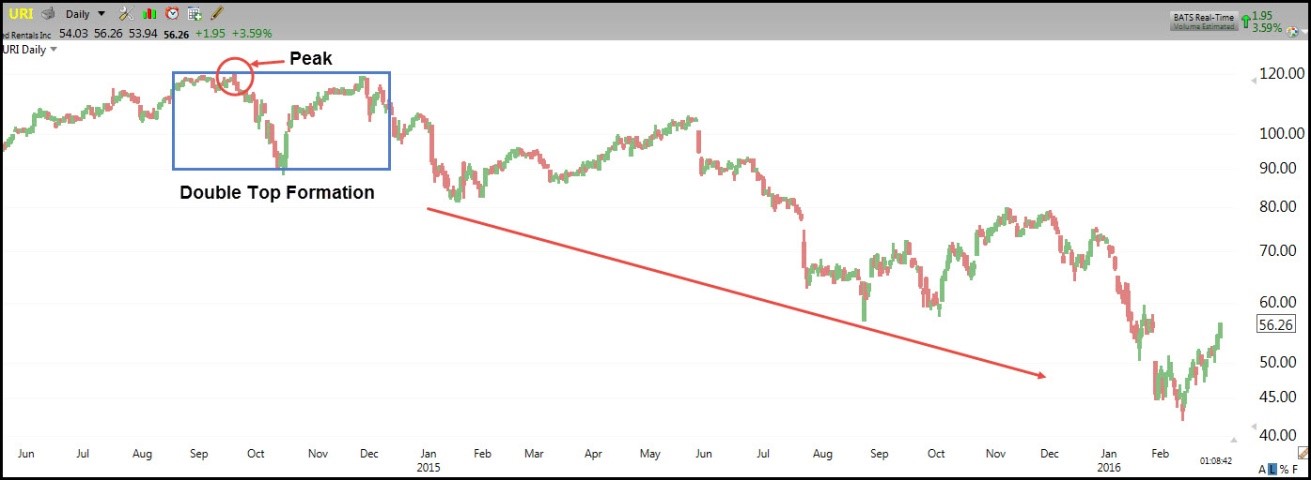
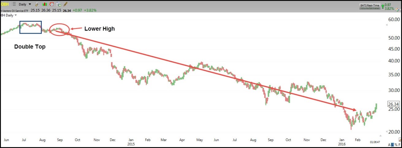
URI is the world’s largest equipment rental provider. They rent equipment and tools to the oil industry, commercial construction industry and industrial companies. URI is a gauge to business expansion or contraction. A rising URI stock price usually correlates to a rising stock market. However, when URI starts to move opposite to the market it signals a possible change in business expansion activities of the industries it serves. One of these industries is the oil production and service industry (represented by OIH an oil services ETF). URI is also related to industrial companies in general so there is a correlation to XLI, an industrial sector ETF. The charts below show the correlation of URI, OIH and XLI.
URI
OIH
XLI
.jpg)
Notice how URI started a double top formation in August/September 2014. The peak price for URI was confirmed by the lower high in November 2014. At this point, traders are warned that something is changing. Since URI serves oil service companies, traders look at OIH to see if a change in trend may be brewing there. Sure enough OIH started its downtrend in September 2014. There is a warning that a change in trend may be occurring in XLI. However, the topping formation in XLI did not start until December 2014 and this was preceded by a large pullback in Oct 2014. One could say that URI and OIH warned that a change in the XLI trend was forthcoming. The consolidation pattern that was developing in XLI starting in December 2014 would most likely resolve to the downside if URI and OIH continued their downtrend.
XLF – Financial Select Sector SPDR
This is the most popular financial sector ETF. The financial sector makes up almost 17% of the S&P500 and is the second largest group of companies represented in the S&P500. The velocity of movement in the S&P 500 depends on the movement of the financial sector. Consequently, if the financial sector is lagging behind the movement of the market, it could signal that the market movement may be short lived. On the other hand, if the financial sector is moving faster than the overall market it could be a leading indicator for the direction or strength of the S&P 500.
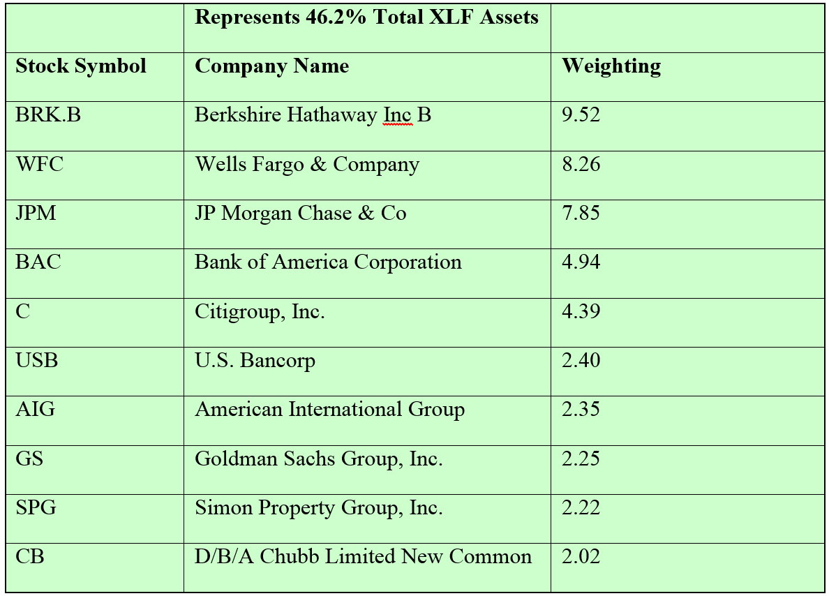
When trading individual stocks in the financial sector, many traders focus on the largest holdings in XLF. The chart below shows the top ten XLF holdings and weightings as of 2/28/2016.
XLF Holdings and Weighting
 Source: Yahoo. Finance
The charts below show the correlation of XLF and SP-500.
XLF
SP-500
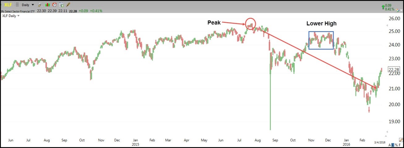
Notice how XLF peaked in July 2015 which is after the SP-500 peak. SP-500 continued to consolidate until XLF faltered in August 2015. Was this a coincidence or did XLF play a role in upholding the SP-500 and then contributed to the decline in August 2015? My answer is this was not a coincidence because the financial sector plays an important role in the SP-500. Granted there are other sectors represented in the SP-500 but the financial sector ranks second. Consequently, I look at XLF for confirmation or divergence from the SP-500.
SPY (S&P 500 ETF) and IWM (Russell 2000 ETF)
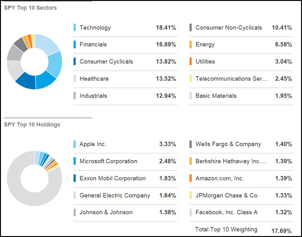
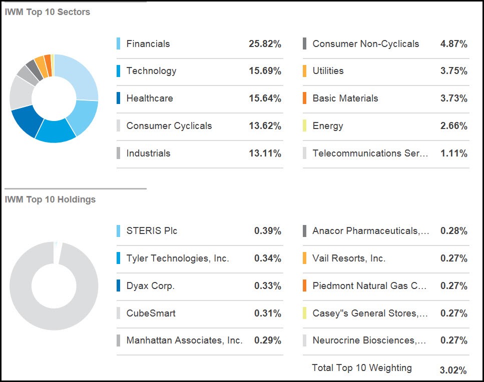
My favorite way to glance at the overall market is by looking at the daily charts of the SPY and IWM. The SPY is an ETF that seeks to replicate the S&P 500 and consists of 500 stocks of large-cap companies from different industries or sectors. IWM is an ETF that replicates the small-cap stocks of the Russell 2000 index. The representation of stocks in the SPY and IWM is grouped into sectors and the sectors are weighted so that some sectors have more representation than others. The individual stocks and sector weightings in the SPY and IWM change from time to time as companies are added and removed from the corresponding indices. Below are the sector breakdowns and top ten holdings/weightings for the SPY and IWM.
Source: ETF.com
Notice that AAPL represents more than 3% of the SPY holdings. Due to AAPL’s large market cap and large representation in the SPY, it has a major influence on SPY’s movement. There is often a direct correlation with the movement of AAPL and the SPY. As a result, I look at AAPL for clues on potential movement or continuation of movement in the SPY.
Source: ETF.com
Relationship of IWM and SPY
Often times, IWM will confirm the strength in the SPY and forewarn of a change in the SPY’s trend. The SPY consists of 500 stocks and IWM consists of 2000 stocks. Also, small-cap stocks tend to weaken or strengthen before large-cap stocks do. I look at IWM for clues of a trend change and confirmation of strength in the prevailing trend. If the SPY is in an uptrend and hitting new highs and IWM is in an uptrend but lagging and not hitting new highs, it probably means that the SPY uptrend is weak. In my opinion, a trend in the SPY is strongest when IWM moves in tandem with the SPY or even moves ahead of the SPY.
Movement in IWM can be more reliable than the SPY due to the number of stocks represented and the fact that there is more of an equal weighting in IWM when compared with the SPY. Think of it this way. If AAPL, AMZN and FB have a big move that is almost 6% of the SPY and more likely than not the SPY will move along with them. IWM does not have this characteristic because of more equal weighting of the 2000 stocks. Despite this fact, I still rely on the SPY for overall market direction and look to see if IWM is confirming this direction.
Below are charts of the SPY and IWM along with a comparison of price behavior.
SPY
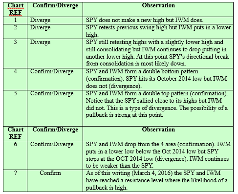
The table below provides an explanation of the reference number and symbols that appear on the above charts.
Looking at the situation as of March 4, 2016, I am pairing back my long positions and tightening stops on open long positions. Should I see a sell signal on either chart I will consider going short. My favorite ways to short the market are to go long inverse ETFS. In particular, I like UVXY (leveraged VIX (volatility index ETF) and TZA (inverse ETF of IWM). By trading inverse ETFs I avoid the complications of options and I can still trade bullish chart patterns because inverse ETFs will move bullishly in a declining market.
Going through the comparison of SPY and IWM price behavior provides me with information that influences my trading attitude. When SPY and IWM have confirming behavior, I have confidence in the prevailing trend and make my trading choices in that direction. When SPY and IWM have diverging behavior in terms of trend or strength of move, I become cautious with the prevailing trend. This means that I trade smaller positions and take profits sooner.
The trend is a trader’s friend and most of my trading focuses on the trend that the SPY is demonstrating. Will I trade stocks moving in the opposite direction from the SPY? You bet I will! How I do this is the subject of another article though.
The next time you want to take a quick pulse of the market consider my five favorite stocks which are
- COPX (Global X Copper Miners)
- FDX (FedEx Corp)
- URI (United Rentals, Inc)
- XLF (Financial Sector ETF)
- SPY/IWM (SP-500 ETF and Russell 2000 iShares ETF)
You will get a quick view of the condition of the market’s foundation without the information overload!